In this article, we’ve covered all you need to know about design systems that make a great SaaS product and the current UX best practices that are trending for all the right reasons.
Software-as-a-service (SaaS) is presently one of the most feasible choices for businesses seeking agility, accessibility, and functionality in highly competitive business scenarios.
SaaS products are among the fastest-growing segments in the IT industry, and studies by Gartner indicate that the service-based cloud application industry will hit $143.7 billion in 2022.
Establishing a SaaS product that rises above the clutter can help you impress your customers and make your product a hit with them. In addition, a great SaaS design system is organically more usable and will help you attain your business goal faster.
Designing a versatile system requires a perfect blend of the different UX UI elements to provide seamless user interaction.
What is a design system?
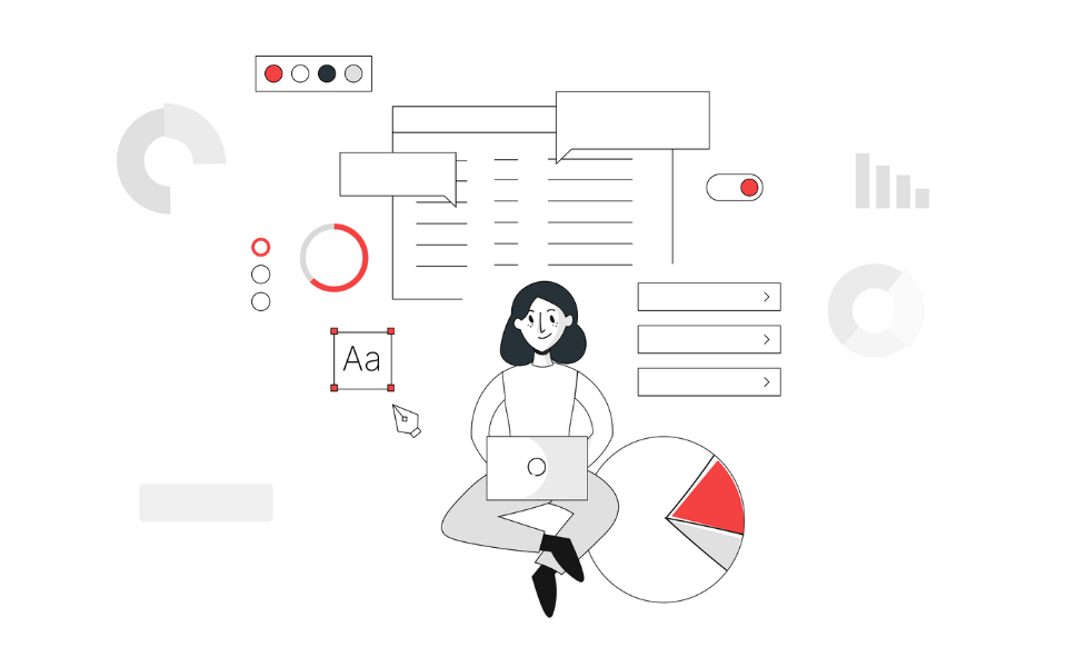
A design system is a suite of standards for presenting the visual components that constitute your app or website. For your better understanding, they could be categorized as follows:
– Foundation – elements include typography, colors, the grid and logo.
– Base Components – includes the buttons, panels, forms, layout and navigation
– Extra Components – comprises the tables, icons, alerts, modals, etc.
– Bonuses – features internationalization, blank states and text utilities.
Alongside the innovative features you’ve introduced, a well-ideated, appealing and sustainable interface design is key to offering your users a superior product experience.
A study comprising over 8,000 consumers and business buyers spanning 16 countries revealed that 84 percent of customers valued their experience with the business as important as its product or service offerings. Therefore, a versatile visual design – conceptualized by skilled UI designers – plays a crucial role in developing product designs relevant to the customers’ needs and usage patterns.
Even if you are a new entrant, your design should be faultless, reflect your business vision, appeal to your target users, and present an overview of how your product will look.
Organizing a Design System for SAAS Platforms
An essential facet of a design system is its organization. How you structure your design system will determine how maintainable and scalable it is over time. A good organizational structure will help you save time while making changes or additions to the system later.
To achieve this, it is essential to define the Design System as a single source of truth in a way that discourages different stakeholders from getting their information from various sources. The advantages of having a centralized design system are:
– When changes need to be made, they can be implemented in one go rather than individually across products.
– The system’s scalability increases as it becomes easy to add or remove products without affecting the others.
– It is easier to track and manage changes when they are all in one place.
– The design system can be reused or shared with other teams.
There are various ways of organizing your design system. Here are some of the most popular methods:
By component type:
All the components are grouped according to their type in this approach. For example, all the buttons will be together, all the icons in another group, and so on.
By product:
In this approach, all the design system components are grouped according to the product they are a part of. For example, if you have a website and a mobile app, all the components for the website will be under one heading, and all the components for the mobile app will be under another.
By screen:
Under this, all the design system components are grouped according to the screen they are a part of. For example, all the components for the home screen will be under one heading, and all the components for the login screen will be under another.
By team:
In this approach, all the design system components are grouped according to the team responsible for them. For example, all the components for the front end will be under one heading, and all the components for the back end will be under another.
There is no right or wrong way to organize your design system. The best approach is the one that works best for your team and your products.
What are the best practices for creating a design system for SaaS products?
An excellent and productive design system has the capabilities and composition to convey the essence of the SaaS product by simply looking at it.
1. Colours palette and theme
Colour is integral to design. A visually appealing design attracts the user’s attention without overpowering the content.
Your first step in creating a sound design system should be to select your primary and secondary brand colours. Avoid having too many colours and preferably stick to your platform’s branded colour palette. Next, manage saturation levels to indicate different categories.
Based on your product offering, your SaaS products should have options like success, fail, in transit, on hold, delivered, etc. At the primary level, implement various font sizes and use the widely recognized red and green to indicate positive and negative messages.
You will also need to depict borders, dividers, and backgrounds. Shades of grey are best suited for this purpose. Once you have identified the colours, you can incorporate a few more palettes to show some visually appealing variations and match the background colour at specific stages. Of late dark themes are highly popular.
2. A balanced site structure
Text-heavy product pages can get users bored quickly (such as knowledge base pages). Avoid this by inserting images of your tool, animation, graphics videos, etc., and creatively framing fact sheets. In addition to creating visual content and responsive web designs, SaaS companies employ a variety of styles of headings, bullets, and other elements to infuse appeal and keep the text reader-friendly.
3. Type scale and Spacing Scale
A uniform type scale is essential for adding proportionality from a UI perspective. Set the type scale for every page and then further split it based on the elements on the page. For instance, your design system must implement a fixed font size for the body section of each tab, particular font sizes for headings, bigger fonts for titles, bigger and bold fonts for pricing tags complemented by comparatively smaller sizes for the sub-headings, etc. If you have any free trials of discounts, use a large font size for section titles and highlight them to attract your customer’s attention.
Along with font size, implement suitable letter spacing which adequately represents the headings without making them look awkward. For example, you could proportionally manage the letter spacing for sub-headings and other smaller font size components.
Similarly, irrespective of where you are inserting whitespace – between various items in the section tab or options in the dropdown menu – it is essential and is one of the most widely used elements for any UI design. On the other hand, use your discretion when adding the whitespace. It should not look random or forced.
Also, preferably use 8dp increments to increase the value, thus building a proper layout for your SaaS platform’s UI.
4. Well-planned layout
All the leading SaaS platforms are notable for their excellent layout planning. Your SaaS platform must allow users to locate the information they want quickly. Therefore, implement a layout with a superb overview and display critical information first.
Keep the platform layout simple by optimizing the white. Additionally, building low-fidelity mock-ups can help you determine content placement and complete the wireframing process before commencing the final design.
5. Landing page and content presentation
As competition heats up, landing pages play a critical role in converting traffic. And, when you have only 50 milliseconds to make an excellent first impression, your SaaS landing page should accurately represent your business and its services or products and convert visitors into your valued customers. In addition, using a suitable headline can attract your visitors’ attention and influence them to explore your web pages further.
Likewise, avoid stuffing too much information on a single page as it can overwhelm the user. An ideal design system aims to simplify the page rather than pack in reams of data. It also compartmentalizes and groups similar chunks of information, making it easier for users to locate and read. The use of cards or icons helps to minimize text clutters.
6. Manage data using data visualization and sort and filter functions
Since users find it challenging to assimilate text-heavy pages, choose the type of data you would like to display and select the data visualization type that best illustrates it. This will enable your users to understand critical information about your product quickly.
Similarly, use the sort/filter function and table filters to restrict the use of data. Category-based filters as a drop-down list deliver more accurate results. Proper usage of filters will help your users to shortlist data types from the database by using the relevant filter contexts.
7. Use of shadow effects
It is one of UI’s most widely and often inappropriately used design elements. To avoid inconsistencies, you should objectively plan which elements in your UI would benefit from a shadow effect.
In general, you can use shadowing to raise the interactive elements and/or when your users hover at a specific section or a tab. Likewise, you could implement a dropdown or popover shadow effect, common in nearly all SaaS UIs, while distant shadowing works well for modal components.
8. Use Wireframes and prototypes
Designers visualize review changes along the customer journey before final deployment. Using wireframes and prototypes helps to reduce the error margins during the testing and implementation stages.
Importance of design system for your SaaS products
A significant portion of a developer’s time is spent sorting issues that could have been addressed during the design phase. A well-planned design system will benefit your SaaS product in the following ways:
1. Stability and Consistency:
Lack of stability leaves your product vulnerable to bugs and user experience-related issues that can take time and eat into your budget. Design systems offer readily available, reusable patterns and assets that your product team can implement at ease and without starting from the basics each time.
With a well-planned design system, every component – button, input, page layout, font, etc. will have the same style, whether you’re on the web app or marketing site.
2. Agility:
A significant chunk of time is spent planning users’ layouts, capabilities, and behaviors. Having all of this readily available means it can be instantly shared across your product team, allowing them to build or make product enhancements quickly. Further, the time saved can be diverted towards solving other issues, thus reducing the time spent on repetitive and mechanical tasks.
3. Manageability:
The capability to add new pages and features without hassling over the stability and consistency facilitates overall growth as the design system eliminates duplication of effort. For example, there’s more clarity on fundamental questions such as layouts and looks, leading to a shorter onboarding time for the newcomers.
4. Usability:
Contrary to popular belief, design systems are not only used by designers. Design systems for SaaS products, including developers, can comprise code, simple snippets, and front-end frameworks. In each case, developers can use the pre-approved, reusable code templates in combination to create new pages and features easily or restructure old ones.
Moreover, the shared system for naming things enhances the quality of product-related written and spoken discussions between the developers and designers, resulting in improved capabilities to resolve user problems as well as front-end issues.
Examples of some great design systems
Having read through the cheat sheet on design systems, glance through some great design SaaS UI examples for practical insights on some of the most successful design systems:
This cloud-based workplace message platform is a perfect example of SaaS UX Design facilitating personalization. Slack make processes so simple that even new users can onboard an entire team within minutes. Users can log in to new devices with the system’s magic connection’ without entering their passwords.
This marketing automation platform is another excellent example of good SaaS web design. The minimally designed platform was a hit with users, and MailChimp has been able to scale up from an email service to a marketing hub for small businesses, thanks to a great design system.
Dropbox, a SaaS cloud backup and sync platform, is an excellent example of efficient SaaS website design. Its themes, straightforward menu, simple website presentation, templates, attractive CTA buttons, and registration forms offer users a no-fuss and easy-to-use platform, significantly contributing to its popularity and success.
Conclusion
When choosing the format of your SaaS design system, consider who will be using it. You could take into consideration parameters such as their level of technical knowledge (designers, developers, or even non-technical teams from marketing and finance); the amount of privacy needed (do you strictly work with internal teams or do you prefer freelancers; should it be easy sharing or by invite only); and finally the preferred medium (will you need to generate print copies or will your teamwork exclusively online).
Design Systems can help you quickly build a scalable and stable SaaS product which opens up opportunities to attract potential customers and grow your business.
A viable UI design will encourage your buyers to open your app and explore your product or services. A functional and thoughtful UX UI design shows that you care about their convenience and have a good understanding of their requirements. Therefore, it is critical to impress them and meet their expectations from the very first interaction.


