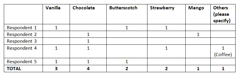


Terms of Use
The use of this site and the content contained therein is governed by the Terms of Use. When you use this site you acknowledge that you have read the Terms of Use and that you accept and will be bound by the terms hereof and such terms as may be modified from time to time.
- All text, graphics, audio, design and other works on the site are the copyrighted works of nasscom unless otherwise indicated. All rights reserved.
- Content on the site is for personal use only and may be downloaded provided the material is kept intact and there is no violation of the copyrights, trademarks, and other proprietary rights. Any alteration of the material or use of the material contained in the site for any other purpose is a violation of the copyright of nasscom and / or its affiliates or associates or of its third-party information providers. This material cannot be copied, reproduced, republished, uploaded, posted, transmitted or distributed in any way for non-personal use without obtaining the prior permission from nasscom.
- The nasscom Members login is for the reference of only registered nasscom Member Companies.
- nasscom reserves the right to modify the terms of use of any service without any liability. nasscom reserves the right to take all measures necessary to prevent access to any service or termination of service if the terms of use are not complied with or are contravened or there is any violation of copyright, trademark or other proprietary right.
- From time to time nasscom may supplement these terms of use with additional terms pertaining to specific content (additional terms). Such additional terms are hereby incorporated by reference into these Terms of Use.
Disclaimer
- The Company information provided on the nasscom web site is as per data collected by companies. nasscom is not liable on the authenticity of such data.
- nasscom has exercised due diligence in checking the correctness and authenticity of the information contained in the site, but nasscom or any of its affiliates or associates or employees shall not be in any way responsible for any loss or damage that may arise to any person from any inadvertent error in the information contained in this site. The information from or through this site is provided "as is" and all warranties express or implied of any kind, regarding any matter pertaining to any service or channel, including without limitation the implied warranties of merchantability, fitness for a particular purpose, and non-infringement are disclaimed. nasscom and its affiliates and associates shall not be liable, at any time, for any failure of performance, error, omission, interruption, deletion, defect, delay in operation or transmission, computer virus, communications line failure, theft or destruction or unauthorised access to, alteration of, or use of information contained on the site. No representations, warranties or guarantees whatsoever are made as to the accuracy, adequacy, reliability, completeness, suitability or applicability of the information to a particular situation.
- nasscom or its affiliates or associates or its employees do not provide any judgments or warranty in respect of the authenticity or correctness of the content of other services or sites to which links are provided. A link to another service or site is not an endorsement of any products or services on such site or the site.
- The content provided is for information purposes alone and does not substitute for specific advice whether investment, legal, taxation or otherwise. nasscom disclaims all liability for damages caused by use of content on the site.
- All responsibility and liability for any damages caused by downloading of any data is disclaimed.
- nasscom reserves the right to modify, suspend / cancel, or discontinue any or all sections, or service at any time without notice.
For any grievances under the Information Technology Act 2000, please get in touch with Grievance Officer, Mr. Anirban Mandal at data-query@nasscom.in.